SwiftUI: Custom Label Style
When creating labels in SwiftUI it's possible to add a LabelStyle to it which defines how the label will appear on screen. When no style is applied SwiftUI will choose between the pre-defined styles based on context. So if the Label is placed in a regular view it will display an icon on the left and the text on the right. In a navigation bar it will just display the icon. If you want to override this behavior you can set the labelStyle modifier like this:
Label("Some Text", systemImage: "circle")
  .labelStyle(.iconOnly)
Customizing LabelStyle
But what if you want the icon on the right of the text or above? This is where custom styles come in.
The following example shows the minimum implementation of LabelStyle. In this case we want to display the icon centered above the text. It's a struct which conforms to LabelStyle. This struct requires a function called makeBody(configuration: ). The configuration parameter for LabelStyle includes the title and the icon. We can now create a VStack to layout the content vertically. Then we first call configuration.icon and then configuration.title.
struct MyCustomLabelStyle: LabelStyle {
  func makeBody(configuration: Configuration) -> some View {
    VStack {
      configuration.icon
      configuration.title
    }
  }
}
This on itself can already be used on your labels but it's not good practice:
Label("Some Text", systemImage: "circle")
  .labelStyle(MyCustomLabelStyle())
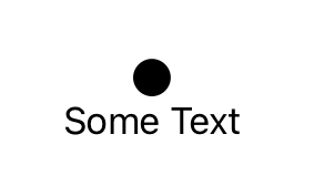
As you can see the icon is now rendered above the text:
Good Practices
Now let's work on our coding good practices. We extend LabelStyle with the condition that Self has to be MyCustomLabelStyle. Inside we define a static computed variable of type Self which returns our MyCustomLabelStyle(). You can name that variable whatever you want.
extension LabelStyle where Self == MyCustomLabelStyle {
  static var custom: Self {
    MyCustomLabelStyle()
  }
}
Now the LabelStyle can be applied to your label in the same way how you apply the .iconOnly or other default styles.
Label("Some Text", systemImage: "circle.fill")
  .labelStyle(.custom)
Where to go from here?
In this example we only added the icon and title parameters of the LabelStyle configuration to a VStack. But as in any SwiftUI View you can add modifiers to further customize the appearance like .font, .imageSize, etc. or even add other static elements like spacers or dividers.
Play around a bit and have fun coding!
